Step-by-Step Guide To Building a sales Dashboard in Excel
Inspired by Mo Chen's Youtube Tutorial.
Data Analysis, Dashboard, Microsft Excell, Pivot Tables
In this blog post, I share the detailed process I followed to recreate an Excel dashboard project, inspired by Mo Chen's YouTube tutorial.
Follow along as I walk you through each step, from gathering and transforming data to creating pivot tables, adding interactive elements, and designing a visually appealing dashboard. This guide will help you build your own dynamic and interactive Excel dashboard, just like I did!
Whether you're analyzing sales data, tracking performance metrics, or presenting business reports, an Excel dashboard can be a powerful tool in your data analysis toolkit.
1. Gather and Transform the Data
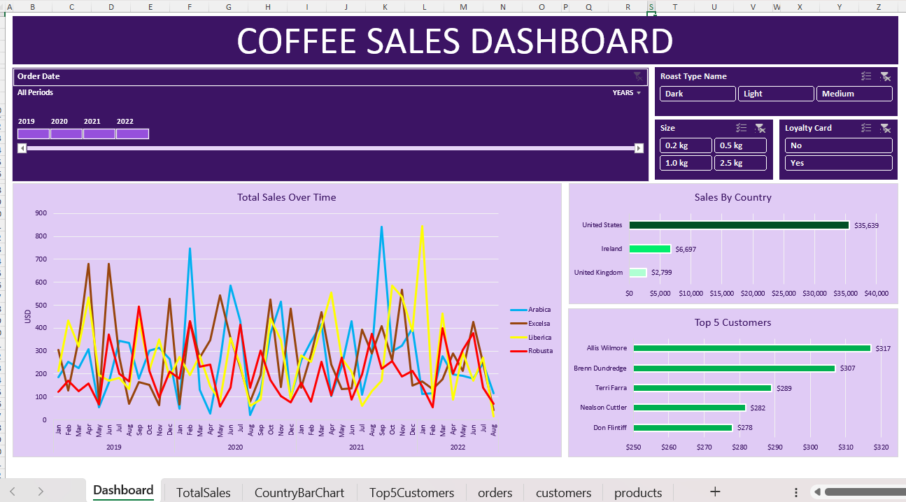
The first step in building a dashboard is to gather and transform the data. In Mo Chen's tutorial, he uses a dataset on coffee bean sales. You can follow these steps to prepare your data:
- Import the Data: Load your dataset into Excel. This can be done by copying and pasting the data or using the "Get Data" feature to import from various sources.
- Clean the Data: Ensure that your data is clean and free of errors. This includes removing duplicates, handling missing values, and correcting any inconsistencies.
- Transform the Data: Use Excel functions like XLOOKUP and INDEX MATCH to look up customer and product information from different tables. This helps in creating a unified dataset that can be easily analyzed.
2. Create Pivot Tables and Pivot Charts
Pivot tables and pivot charts are powerful tools for summarizing and visualizing data. Here's how to create them:
- Insert Pivot Tables: Select your data range and insert pivot tables to analyze the sales data by various dimensions such as coffee type, country, customer, roast type, size, and loyalty card.
- Create Pivot Charts: Use the pivot tables to create pivot charts that visually represent the data. These charts can include bar charts, line charts, and pie charts, depending on the type of analysis you want to perform.
3. Insert Timelines and Slicers
To make your dashboard dynamic and interactive, you can add timelines and slicers:
- Insert Timelines: Timelines allow you to filter data by date ranges. Insert a timeline and link it to your pivot tables to enable date-based filtering.
- Add Slicers: Slicers provide an easy way to filter data by specific categories. Insert slicers for dimensions like coffee type, country, and customer to allow users to interact with the dashboard.
4. Format and Design the Dashboard
The final step is to format and design the dashboard to make it visually appealing and user-friendly:
- Layout and Design: Arrange the pivot tables, pivot charts, timelines, and slicers in a logical and aesthetically pleasing layout. Ensure that the dashboard is easy to navigate and understand.
- Formatting: Apply consistent formatting to the charts and tables. Use colors, fonts, and styles that align with your brand or presentation theme.
- Add Titles and Labels: Clearly label each element of the dashboard and add titles to provide context to the users.
Conclusion
Building an Excel dashboard is a rewarding process that can greatly enhance your data analysis capabilities. By following the steps outlined in Mo Chen's YouTube tutorial, you can create a dynamic and interactive dashboard that effectively communicates your data insights. Whether you're analyzing sales data, tracking performance metrics, or presenting business reports, an Excel dashboard can be a powerful tool in your data analysis toolkit.
For a detailed walkthrough, you can watch Mo Chen's tutorial
here.